Our Kitchen Transformation – Inspired by Mother Nature
Posted by Toni Collins | Renovation, VR Blog | No Comments‘Mother Nature as an influence is a bottomless resource – she just gives and gives and gives’. To quote the great Megan Morton from her book – Home Love.
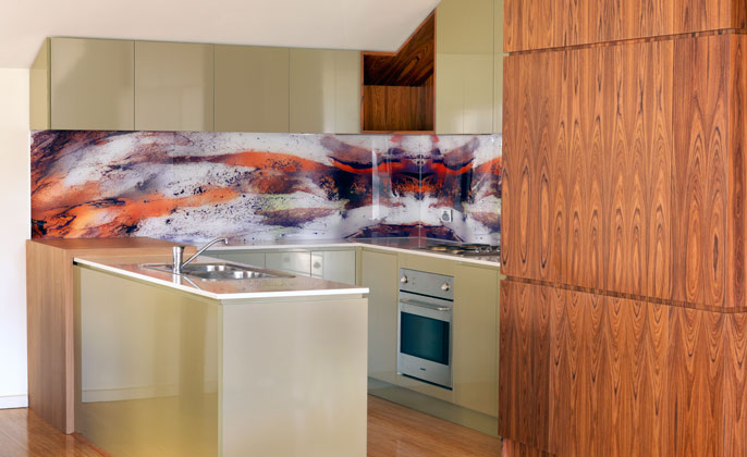
When I first wrote about our kitchen in October 2013 I said, ‘… our own kitchen is only suitable for the ‘before’ shot… ’ And now… many months down the track, we are delighted to report that our kitchen face lift is finished and I do believe the kitchen is very worthy of an ‘after’ shot.
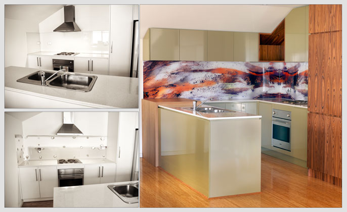
BEFORE & AFTER
Kitchen design by Patricia La Torre of Outside Inside Building Elements
Build (or more accurately the craftsmanship) by Tony Bezzina of TCB Cabinets
We often say to people who are considering a VR Art Glass splash back – the selection of the artwork… actually narrowing all of the possible visual options down to ‘the one’, can be the hardest part. Our experience of making the artwork selection was no exception.
We were however guided by a particular inspiration that did focus the options and lead us to a final selection without too much pondering. Given we live in an urban setting where exposed power lines and the neighbours’ external brick wall are visible from one window… the available elements of nature seen through our front window is a view we find calming and cherish. Therefore, adding the colours and forms of our surrounding nature – an enormous tree – and downplaying the various ‘urban’ references we can see – that was the inspiration and direction for us. Evoking a feeling of tranquillity within our urban abode… that was the aim.
And so, without hesitation, an artwork from the ‘Elements Collection’ was selected, and became the design inspiration source for all kitchen materials. Our designer Patricia La Torre said,
“The materials selected were customised to work in with the various colours in the artwork. With considerable movement in the artwork, it was important that the surrounding colours and materials were complimentary. The timber panelling to the tall cabinets worked in perfectly with the warm colour in the splashback, simultaneously further connecting the artwork with movement in the grain. By incorporating colours that relate to the artwork, then the design is more harmonious, balanced and pleasing to the eye.”
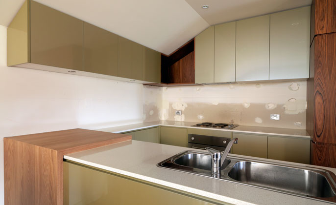
Our new kitchen without the VR Art Glass splashback… it’s not really working is it?
Something is certainly missing.
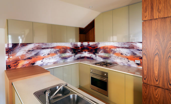
VR Art Glass splashback in place – the kitchen is now complete!
Splashback features art from the ‘Elements Collection’
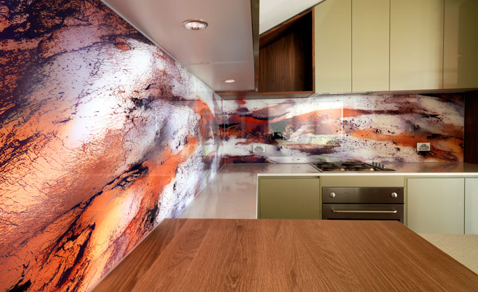
“I try to incorporate some item of artwork or individuality in every design and I think a ‘feature’ glass splashback is a perfect solution!” Designer – Patricia La Torre

