Projects Archives - Visual Resource

“Honey – It’s Cold Outside”

Posted by Toni Collins | VR Art Glass - Projects, VR Blog | No Comments

The lure of a warm shower during the depths of winter is hard to beat.

And why not linger longer under the warm spray when you have a treat for the eyes to feast upon as well?

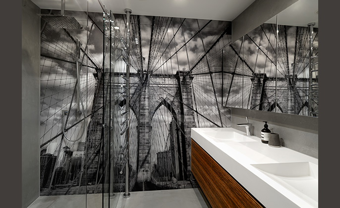
The Port Melbourne apartment enjoys a bathroom boasting a wall sized VR Art Glass feature. Not a tile or grout line in sight! Instead, the sleek and seamless finish of VR Art Glass.

The bathroom design by Sam Robinson was always destined to be fresh and stylishly appointed. The decision to incorporate a wall sized VR Art Glass piece spanning from shower to vanity delivers a statement, as well as a stamp of individuality for homeowners.

The couple selected an image of Brooklyn Bridge for its personal relevance, along with its dramatic architectural stature. The result: the bathroom is beautifully designed, visually engaging and is one of a kind!

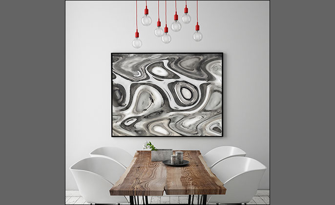
VR Artwork - Patterns Neutral # 17 - Photo Art by Michael Collins for Visual Resource

WALL ART – Be Inspired

Posted by Toni Collins | VR Artwork - Projects, VR Blog | No Comments

Do you have blank walls in need of some attention?

Look about… are there any bare walls around you? Maybe today’s the day – that wall has been blank for far too long.

The addition of art in your space is a chance to play and ‘accessorise’.   Accessories bring the finishing touches to a room; they make a space liveable, fun and provide the key to individuality.

Here are a few thought starters to help unleash your inner art buyer…


HOW DO I FIND THE ‘RIGHT’ ARTWORK STYLE FOR THE SPACE?

Forget ‘right or wrong’, ‘good or bad’ art. These judgments and criteria are not only completely subjective; thoughts along those lines will stifle and be unhelpful. Here is an alternative…

Your taste in art is entirely personal. Choose something you love!

Art bought with your heart will never disappoint.


OPTIONS WHEN SELECTING AN ARTWORK:

Go bold and create a focal point.

  •  Your new artwork does not need to match the paint colour or furniture in your room.
  • If you have mostly neutral furnishings this provides a ‘blank canvas’ if you like… where you can be guided by the artwork that moves you, regardless of its style, shape or colour palette.
  • You may like to make a splash with an abstract photo art (for example): rich in colour along with a sense of movement in the design – adding interest and excitement.
  • Then… you can draw inspiration from the artwork, for items like cushions or vases to reflect some colours from your art. These ‘accents’ will serve to tie the room together.
  • Repeating colours within the artwork (accents), increases the artworks impact in the room.
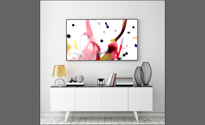
Wall Art by Visual Resource - PAINTERLY No 12

Art = accessorising = the key to individuality. Abstract photo artwork – Painterly # 12. Creative & bold – the perfect focal point.


Or, choose subtle tones to complement your existing décor.

  • An alternative approach when selecting an artwork is to select a piece that blends with your interior – combining colours, shapes, forms and styles that are completely in unison with your interior. This gives harmony where the artwork is a team player, rather than the star.
  • Imagine photo art of a cityscape or landscape for example, finished in black & white or a sepia tone.
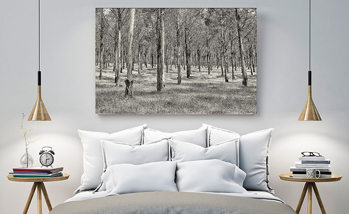
Photographic Artwork Mono by Visual Resource - Wall Art

Photo artwork ‘Landscape Mono 03’. The artwork blends with the tones and compliments the natural texture of the interior finishes.


THOUGHTS ABOUT ARTWORK SIZE

The scale of the artwork in relation to the area it will be placed is worthy of some thought. Respected interior designer and stylist Shannon Fricke in her book ‘How to decorate’ counsels:

“An oversized canvas hung on a small wall does not make for a harmonious space, and nor does a tiny canvas on a large wall. When the scale is wrong, it doesn’t matter how beautiful the artwork is, the result won’t feel right.”        


Tips to help with the consideration of artwork size include:

  • A small piece of art may not work above a large piece of furniture. Use a bigger artwork!
  • The goal is to create balance.
  • If you have a huge wall running the length of your living area, avoid one small artwork. (It may give the impression of a postage stamp on your wall.)


The home pictured next is a prime example of a grand scale space, begging for a grand scale artwork.
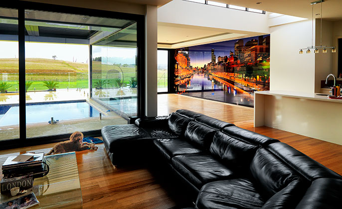
VR Art Glass Printed Glass Wall Feature Melbourne Skyline Photo Art

VR Art Glass printed glass mural wall – ‘Melbourne Skyline # 7’ – Photo art by Michael Collins for Visual Resource.


TIP: a practical way to visualise and decide the right artwork size.

  • Make a template from paper to see how the size looks, within the space.
  • Cut out (brown) paper to the size you are thinking for the artwork. Stick this to the wall with masking tape.
  • Add more (brown) paper to increase the size (if needed), or cut away brown paper to reduce the size (if needed.)
  • Keep experimenting until you feel sure the size (of brown paper representing your artwork size) will suit the space.
  • It’s all about scale!
  • Measure the size of the (brown paper) template. Let VR know the size and VR can prepare a quote for you.


How can Visual Resource help?

All VR artworks are prepared to your custom requirements, including the finish and size. We will ask you, ‘what size would you like your finished artwork to be?’ The custom nature of VR artworks gives you great flexibility and the perfect art for your space.


HEIGHT FOR HANGING THE ART

  • One tip is to position your artwork so that the centre of the piece is at eye level.
  • 152cm off the floor level is an indication.


AND WHAT ABOUT THE PRICE?

Yes it is true, an original photographic artwork from VR does cost more than a poster print from Ikea. But you are getting so much more for your money.

While it is a reality, we all have financial constraints and budgets to work within. Remember, if you find the perfect artwork – it is an investment. (Try to think long term, the price will be long forgotten while you enjoy looking at the artwork for years to come.)
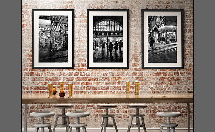
 

Melbourne Wall Art - Photography by Michael Collins for Visual Resource

Cafe featuring various photo artworks from the Modern Gallery & Melbourne Collections. Finish: traditional black & white silver gelatin photographic prints.
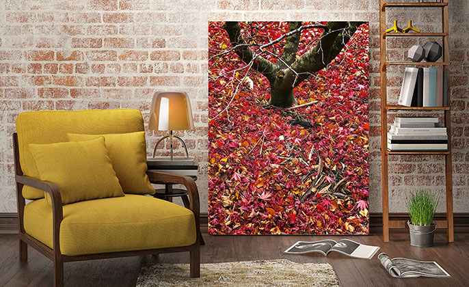
Wall Art - Photography by Michael Collins for Visual Resource - Seasons Autumn No 18

VR artwork ‘Seasons Autumn # 18’, seen in the Classic Gallery


Try not to be restricted and restrained by your overall decorating scheme when choosing artwork. Instead – go for what you love. Vibrant, dynamic artwork can add interest and pop in an otherwise sedate interior scheme.

Relax and trust your instincts. If it helps… consider that the stakes are not as high as selecting a floor finish or the kitchen design. So be brave and save a blank wall today!
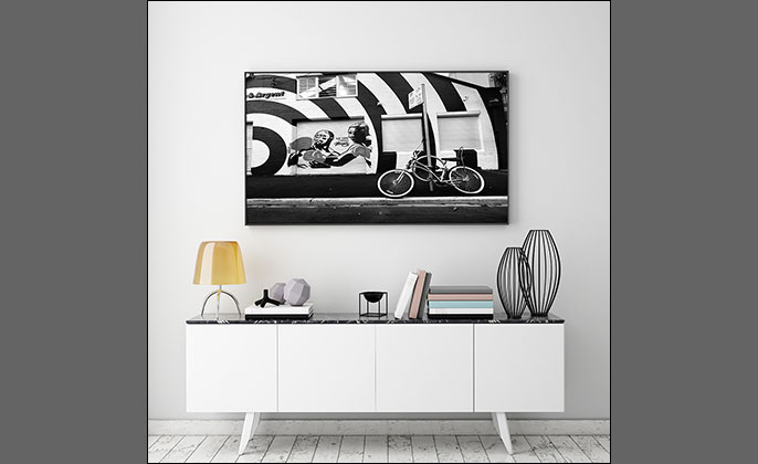
Photo Artwork by Visual Resource THE BOXERS Kings Cross Sydney

‘The Boxers’ photo artwork from the Kings Cross – Sydney Collection. While graphic and bold in visual content, the tones complement the decor.
 

VR Art Glass delivers above & beyond… wall art on a grand scale

Posted by Toni Collins | VR Art Glass - Projects, VR Artwork - Projects | No Comments

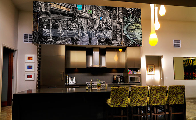
VR Art Glass: custom photo artwork printed on glass – commands attention while taking centre stage within a modern Rosebud home.

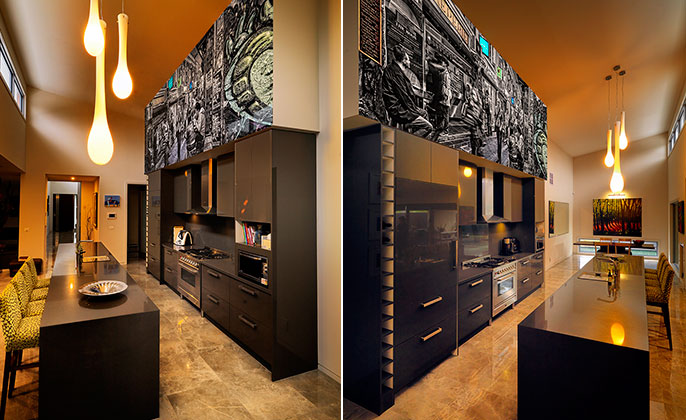
Often described as providing a feature within a kitchen, this home takes the potential of VR Art Glass to new heights.  The vast bulkhead delivered the perfect blank canvas to add an engaging, visually stunning piece of art.

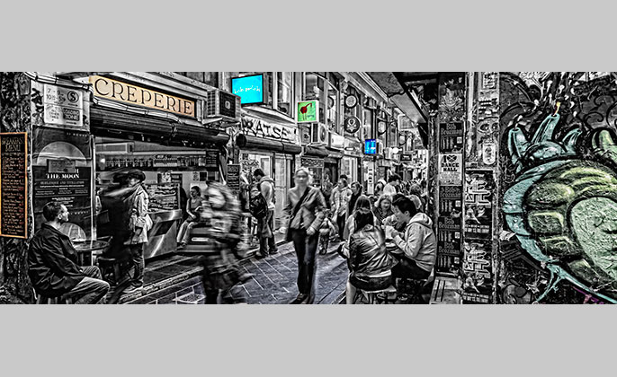
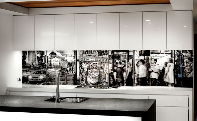
The VR photo artwork Centre Lane gives the feeling of a slightly gritty yet vibrant Melbourne.  The movement of the city together with the invitation to sample our café culture – all evocatively on display in the grand kitchen setting of this home.

The original photo artwork created by Michael Collins for Visual Resource was filled with colour.  The homeowner had a particular vision for her artwork, so working collaboratively with VR the artwork was converted to black & white, and then some gentle pops of colour were reintroduced.  With a keen eye for balance, our client guided the creative direction of this piece sensitively and with great success.
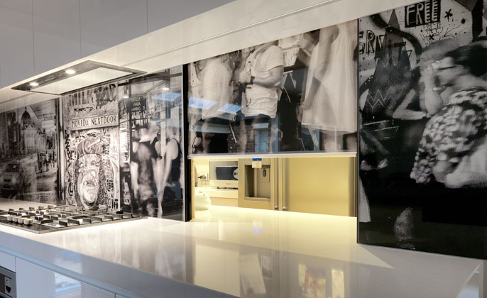
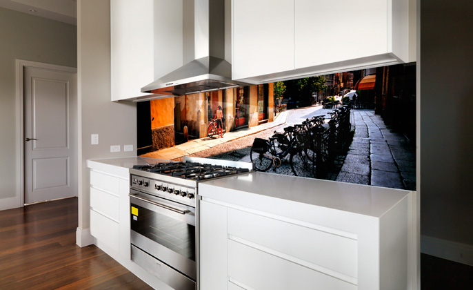
VR ArtGlass Printed Glass Melbourne Streetscapes by Photographer Michael Collins

Taking the potential of VR Art Glass to a whole new level. Wall Art within the kitchen – so much more than just a splashback.

VRArtGlass Wall Art Melbourne Centre Lane photo artwork by Michael Collins

‘Centre Lane’ photographic artwork by Michael Collins – customised to meet the creative brief of the homeowner.


Of greatest importance – what does the homeowner think of the end result?

She wrote, “I am gobsmacked! Thanks for working with us to achieve this wonderful result.”

VR Art Glass Printed Glass Melbourne Installation Street Art Photography

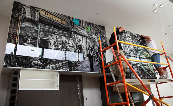
To put into perspective the scale of this art piece… panels are as tall as the installers.

Grand design comes in many shapes and sizes

Posted by Toni Collins | VR Art Glass - Projects, VR Blog | No Comments

A kitchen with heart, and art…

Sharing another fine example of design with heart, by Patricia La Torre of Outside Inside Building Elements.

La Torre encouraged her clients to start the finish selection process with an artwork.  Upon the clients’ selection of VR artwork ‘Natures Shape # 4’ – this became the genesis and inspiration for remaining kitchen materials and colours.

Melbourne kitchen with printed VR Art Glass Splashback

Kitchen design by Patricia La Torre of Outside Inside Building Elements
A kitchen with heart, and art.

This beautifully composed kitchen is an aesthetic triumph.  Of the design process, and specifically in relation to working with a feature artwork, Patricia La Torre said,

‘I try to incorporate some item of artwork or individuality in every design and I think a ‘feature’ glass splashback is a perfect option. 

By incorporating colours that relate to the artwork, then the design is more harmonious, balanced and pleasing to the eye.’  

Splashback with art NATURES SHAPE #4 by Visual Resource

VR Artwork ‘Natures Shape # 4’ – customised to compliment the generous bench to ceiling splashback area.

We feel this kitchen is a shining example of what is possible when great design and colour confidence are delicately balanced.

What does the homeowner think?

“I am absolutely delighted with the kitchen and especially with the featured artwork.  We asked Patricia to design in a ‘wow’ factor and the fantastic splashback (too mundane a word for such a creation!) certainly provides that.  We have had nothing but admiring oohs and aahs from visitors.”  

Visual Resource Splashback with ART

VR Art Glass splashback featuring ‘Natures Shape # 4’
The inspiration source for the remaining kitchen colours and finishes.


VR Art Glass printed splashback melbourne INSTALLATION

The hard yakka involved with installation. It took three men to carry the large VR Art Glass piece up the stairs.


Visually Stunning Bathrooms – VR Art Glass Splashbacks

Posted by Toni Collins | VR Art Glass - Projects, VR Blog | No Comments

Rosemary & John completed a long awaited kitchen overhaul in early 2013.  Included within the well appointed ‘cooks kitchen’ – VR Art Glass splashbacks featuring a bold nature inspired design.

So pleased with the cohesion and visual impact delivered within the kitchen, along with the admiring reactions from visitors when they see the splashback – Rosemary & John decided to feature VR Art Glass within the new bathrooms: considering it the ideal way to achieve uniqueness and individuality for each bathroom.

“Be yourself – everyone else is already taken”  Oscar Wilde

There is something about that quote which rings true regarding the design inspiration behind the new bathrooms.  When John & Rosemary briefed David Slade of David Slade Interior Designs and Rosemount Kitchens, to redesign the bathrooms in their family home, they were clear they wanted each room to be quite different.

VR Art Glass Bathroom Wall Mural Feature Upstairs

VR Art Glass by Visual Resource as a statement feature became the ideal way to achieve
the design intent: INDIVIDUALITY FOR EACH BATHROOM.

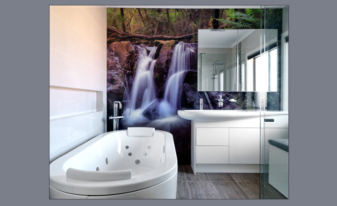
The largest ‘main’ bathroom with the spa bath tub and waterfall feature wall is resort-inspired.  
The client wanted the waterfall to appear as though it was falling into the tub – bringing the outdoors in and appealing perhaps to a naturalist who enjoys showering outdoors in Summer.  Or offering members of a busy family an opportunity to relax in a warm bath in cooler months with the meditative quality of the waterfall in the background.  The floor tiles and basin reflect this organic, natural theme.

Contributor Michael Collins said, “Visual Resource creates art to reflect the personal style of people, and compliment designs.  For this home, the clients took full advantage of the creative license VR Art Glass provides.  Each bathroom is unique because a different family member was in charge of selecting the artwork.  Rosemary selected ‘Natures Shape # 4’ for the guest bathroom which was customised to compliment the space.  While John chose a nature inspired ‘Waterfall’ image – setting the tone for the tranquil retreat achieved in the main bathroom.

With individual family members in charge of the artwork selection task: each bathroom is not only unique – each provides a successful reflection of the character and personalities of the people who live in the home.”

Kitchen Splashback VR Art Glass Elements #11

Where it all began…
VR Art Glass – an exciting option for the kitchen splashback
Featuring Elements # 11 from the nature inspired Elements Collection


Seeking a ‘wow’ feature for a crisp new kitchen

Posted by Toni Collins | VR Art Glass - Projects | No Comments

The crisp, white kitchen of this renovated home – was a fresh and accommodating canvas for the addition of a feature splashback, intended to wow!

The briefing to Visual Resource was really clear: the homeowners of the Footscray residence said:

  • The artwork needs to reflect our style and be of significance to us.  (So not a picture of New York for example.)  But we do love Melbourne!
  •  We like vibrant colour and would love a strong sense of colour within the composition of the artwork.
  •  We are seeking contrast between the crisp, white kitchen – and colour within the splashback.
  •  And of greatest importance… the splashback needs to be a ‘wow’ feature.


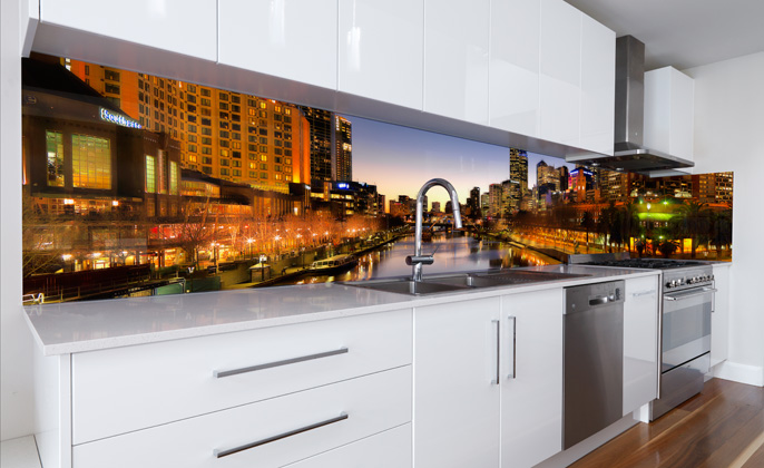
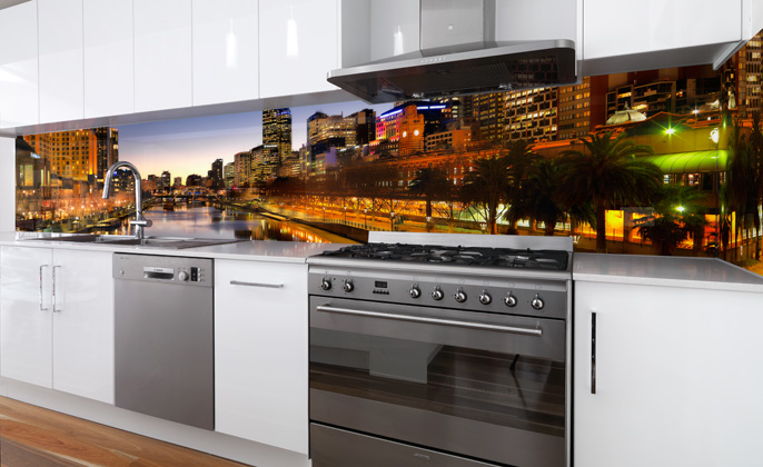
We had our briefing and we set about presenting artwork options to meet all requirements.  After reviewing many options – artwork ‘Melbourne Skyline # 7’ was chosen as ‘the one’ and provided an excellent answer to the briefing.  The VR Art Glass feature splashback compliments the kitchen perfectly.

Printed Splashback Melbourne Visual Resource VR Art Glass

VR Art Glass Splashback
Featuring artwork ‘Melbourne Skyline # 7’ from the Modern Gallery & the Melbourne Skyline Collection


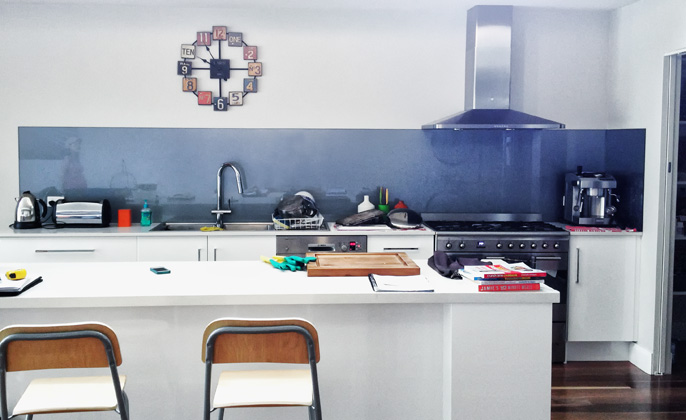
Prior to the addition of the VR Art Glass feature, the splashback was a coloured glass one.  The introduction of overhead cabinetry and VR Art Glass has been positive, contributing to greater enjoyment of this vital home space.         

Next… some shots to show you the kitchen before and during the transition.

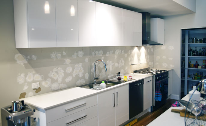
Blue Coloured Glass Splashback

BEFORE
Prior to the addition of the VR Art Glass feature, the splashback was a coloured glass one.


After removal of glass splashback Visual Resource

After removal of the coloured glass splashback.
The canvas is now ready for the addition of a feature splashback – intended to wow!

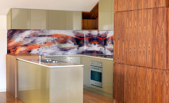
Our Kitchen Transformation – Inspired by Mother Nature

Posted by Toni Collins | Renovation, VR Blog | No Comments

‘Mother Nature as an influence is a bottomless resource – she just gives and gives and gives’.  To quote the great Megan Morton from her book – Home Love.  

When I first wrote about our kitchen in October 2013 I said,  ‘… our own kitchen is only suitable for the ‘before’ shot… ’ And now… many months down the track, we are delighted to report that our kitchen face lift is finished and I do believe the kitchen is very worthy of an ‘after’ shot. 

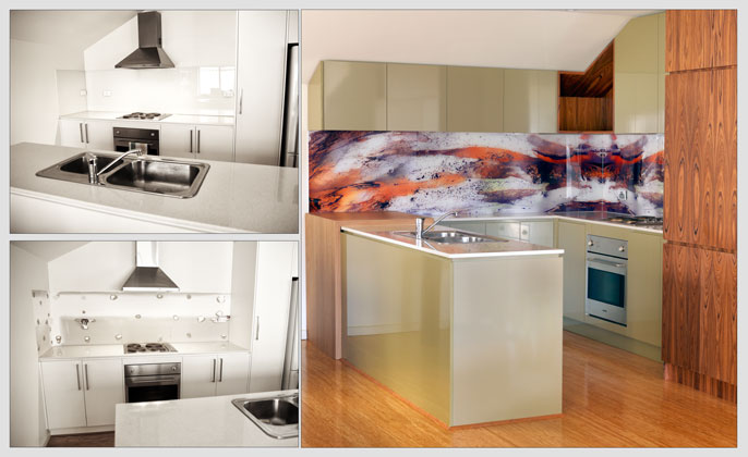
Before & After VR Art Glass Splashback

BEFORE & AFTER
Kitchen design by Patricia La Torre of Outside Inside Building Elements
Build (or more accurately the craftsmanship) by Tony Bezzina of TCB Cabinets


We often say to people who are considering a VR Art Glass splash back – the selection of the artwork… actually narrowing all of the possible visual options down to ‘the one’, can be the hardest part.   Our experience of making the artwork selection was no exception.

We were however guided by a particular inspiration that did focus the options and lead us to a final selection without too much pondering.  Given we live in an urban setting where exposed power lines and the neighbours’ external brick wall are visible from one window… the available elements of nature seen through our front window is a view we find calming and cherish.  Therefore, adding the colours and forms of our surrounding nature – an enormous tree – and downplaying the various ‘urban’ references we can see – that was the inspiration and direction for us.  Evoking a feeling of tranquillity within our urban abode… that was the aim.    

And so, without hesitation, an artwork from the ‘Elements Collection was selected, and became the design inspiration source for all kitchen materials.  Our designer Patricia La Torre said,

“The materials selected were customised to work in with the various colours in the artwork. With considerable movement in the artwork, it was important that the surrounding colours and materials were complimentary.  The timber panelling to the tall cabinets worked in perfectly with the warm colour in the splashback, simultaneously further connecting the artwork with movement in the grain.  By incorporating colours that relate to the artwork, then the design is more harmonious, balanced and pleasing to the eye.”     

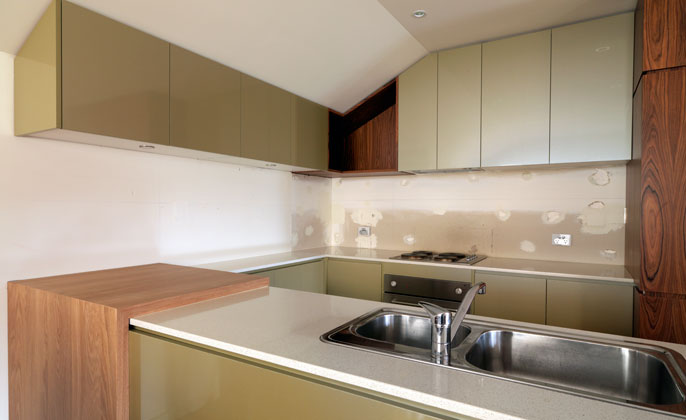
Melb kitchen prior to VR Art Glass Splashback

Our new kitchen without the VR Art Glass splashback… it’s not really working is it?
Something is certainly missing.


Melbourne Splashback VR Art Glass angle

VR Art Glass splashback in place – the kitchen is now complete!
Splashback features art from the ‘Elements Collection’

VR Art Glass Up Close - 'Elements' Artwork

“I try to incorporate some item of artwork or individuality in every design and I think a ‘feature’ glass splashback is a perfect solution!” Designer – Patricia La Torre


Splashbacks with art – VR Art Glass

Posted by Toni Collins | VR Art Glass - Projects | No Comments

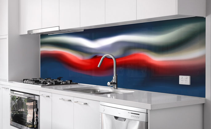
VR Art Glass featuring Colour Splash # 16

HOME

Home is a tiny word for such an important place.

For all of us, it’s where we want to feel safe and warm, protected and comfortable.

It’s also a place from where you draw strength and where you feel your most authentic self.

Quote from – ‘A life less ordinary – interiors and inspirations’,  Zoe Ellison and Alex Legendre. 

VR-Bentleigh-East-#1blog

VR Art Glass ‘Colour Splash # 16’
In harmony with the surrounding decor


VR-Bentleigh-East-#2blog

Abstract art provides a splash of colour – a sense of personality


An evocative kitchen oozing with sophistication & confidence

Posted by Toni Collins | VR Art Glass - Projects, VR Blog | No Comments

We are privileged to see peoples ‘dream kitchen’ take shape (on paper) then come to life in reality.  From the early stages of design, colour and finish selections – all the way through to the build and installation.  We contribute (with VR Art Glass) in one small way to what is often a high involvement, personal and lengthy process. 

The end result often involves seeing sparkling, crisp white kitchens that are always pleasing to look at.  Just recently however, we were delighted to view the kitchen of builder Craig Field and partner Diny of Field Homes.  Viewing the new home designed and built by the couple was a big surprise and affirms something rather significant to me…

Your kitchen can exude a style and mood of your choosing and making.        

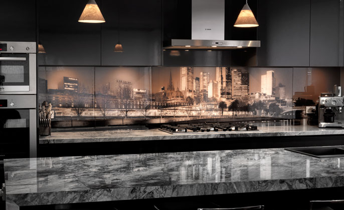
VR ArtGlass Melb Mono#4 Splashback Blackburn

Kitchen design by Diny and build by Craig of Field Homes.
VR Art Glass splashback featuring artwork ‘Melbourne Mono # 4’
‘Super White’ granite bench tops by Melbourne Marble & Granite.


The Blackburn South kitchen is warm, dark and handsome – wearing the striking finishes and sleek colour palette with great confidence.  The deep charcoal of the cabinetry, combined with the dramatic granite bench tops: has style equal to that of a highly considered and well composed bar or restaurant.  

Congratulations Diny and Craig of Field Homes on your stylish and evocative kitchen.  Thank you for reminding me that each kitchen can be unique and a mirror to the personality and style we choose to reflect.

Toni

Langwarrin Kitchen: a monochromatic beauty, bursting with features & personality

Posted by Toni Collins | VR Art Glass - Projects, VR Blog | No Comments

As a Professional Painter, Peter has the opportunity to see the interiors of many homes and kitchens.  Consequently, he knows what appeals to him, along with having a clear vision of the colours and finishes that will endure the test of time.  So when it came time for the couple behind this renovation to plan their own sparkling new kitchen – a classic black & white palette for finishes was confidently selected.

The elegant simplicity of this black & white kitchen is stunning, and while these strong foundations for the design may have been more than enough for some…there is more!  

The kitchen offers surprises and the assertion of an adventurous personality – delivered by a number of well-chosen features. 

Kitchen features include:

1.  The ‘Fire Stone’ Granite on the island bench gives a raw, textural, sensory finish that is heaven.

2.  The tap not only looks like a piece of beautiful metal sculpture… running water features a light which changes colour in sync with the water temperature.  Providing some fun – and it is mesmerising too!  

3.  A sneaky butlers pantry sliding panel (a section of the splashback) – keeps the kitchen ‘front of house’ clutter free, while the ‘back of house’ engine room of food storage and preparation is neatly tucked out of sight.  Genius! 

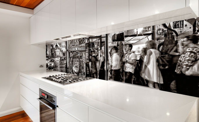
4.  The VR Art Glass splashback featuring artwork Melbourne Mono # 8 – looks fantastic.   “Yes of course… you would say that…”, you may be thinking… but it is true!

VR Art Glass Melb Mono Art Langwarrin kitchen front

VR Art Glass splashback featuring artwork Melbourne Mono # 8

The photographic artwork created by Michael Collins captures the energy and urban pulse of our vital city.  It showcases Melbourne’s eloquent mix of modern and historic architecture.  And while the visual has a modern edge – the black and white presentation affords the artwork a timeless quality.  Melbourne Mono # 8 fits in perfectly with this sleek and elegant kitchen.   

Very successful choices have been made for this kitchen and the end result is a delight.  But enough of what we think… this is what Peter had to say about the experience of working with Visual Resource for the kitchen splashback,

 Hi Michael and Toni,

It is with great pleasure that I send this message to let you know how fantastic our splashback has come up.  Even though we threw a big challenge to you by having the splashback in three pieces to accommodate the sliding window to the butler’s pantry, the job has come up perfect.  Nobody has noticed it is in three pieces until we slide the window up.  Your attention to detail is second to none. 

Thank you Peter.  We are thrilled you are happy with your new VR Art Glass splashback. 

Toni

VR Art Glass Butlers Pantry Access Melb Mono Photo Art

A butlers pantry sliding panel (a section of the splashback)
is just one of the clever and surprising features of the kitchen

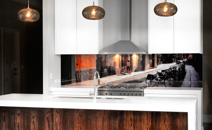
VR Art Glass featuring ‘Cremona # 7’ from the Italy Collection

Posted by Toni Collins | VR Art Glass - Projects, VR Blog | No Comments

Selected image ‘Cremona # 7’ for the VR Art Glass kitchen splashback reinforces the tones from the pendant lights and front of island bench detail – tying these elements together with warmth and charisma.   Perhaps of greatest importance… the artwork looks so comfortably at home within the surrounds.  The space looks and feels lovely!   

Sometimes, few words are needed to present a project: instead, the visuals really do speak volumes.  Such is the case for the Edithvale residence.  Homeowners of the recently completed new build have created a living space quietly confident, with a seemingly effortless style being projected.

VR Art Glass by VISUAL RESOURCE 'cremona # 7' Edithvale front

Edithvale Residence
Featuring ‘Cremona # 7’ artwork from the Italy Collection

VR Art Glass – wall art with a difference

Posted by Toni Collins | VR Art Glass - Projects | No Comments

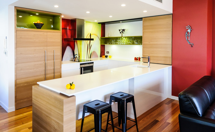
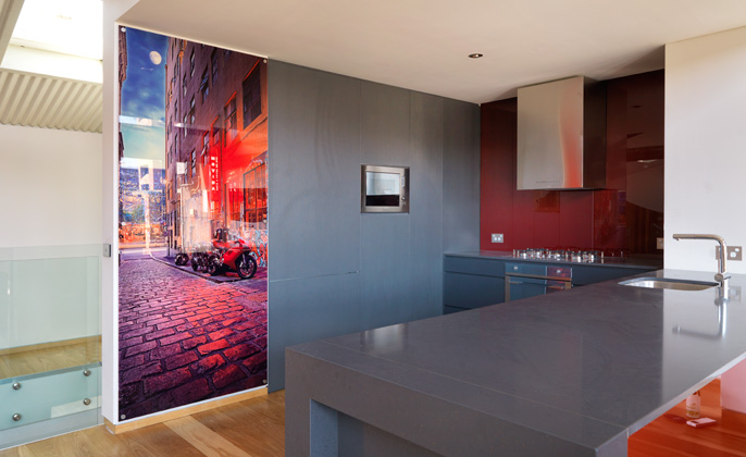
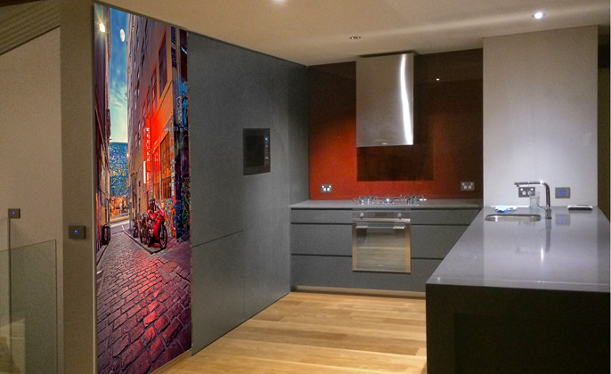
If you have ever dreamed of living inner city in a well-appointed warehouse conversion – then the interior of this Collingwood residence will be worthy of a little green envy.

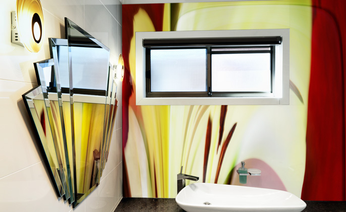
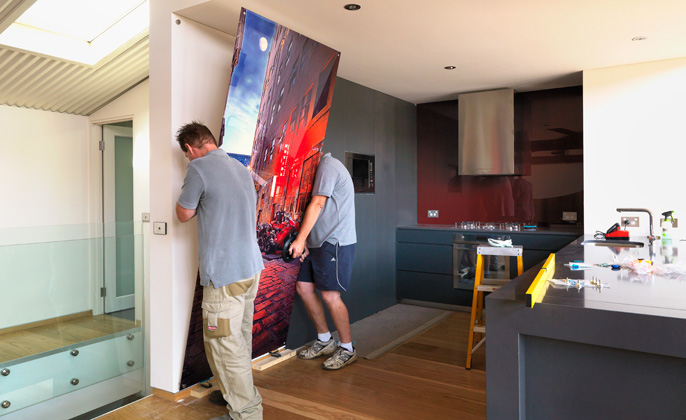
Originally the Sidchrome factory in another lifetime, Interior Designer Patricia La Torre of OUTSIDEINSIDE Building Elements has transformed the interior with aplomb.  The inclusion of a wall sized feature glass artwork in the kitchen area was one of her many recommendations.

“The design incorporated a glass feature panel to add a burst of colour and connect the inner city warehouse apartment to the streets of Melbourne”, said La Torre.

Another great use for VR Art Glass!

Visual Resource VR ART GLASS Collingwood nightshot

Factory warehouse conversion.
Architectural design by Robert Busselmann of Robert Busselmann & Associates.


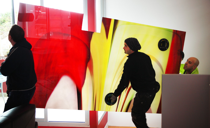
Visual Resource VR ART GLASS Collingwood Install

The hard work… installation thanks to Glaziers Jasen & Dave.